DigitalBridge: Early applied AI in retail
Role: Head of Product
Years: 2016–2019
Focus: Product strategy, UX research, UI design, product delivery
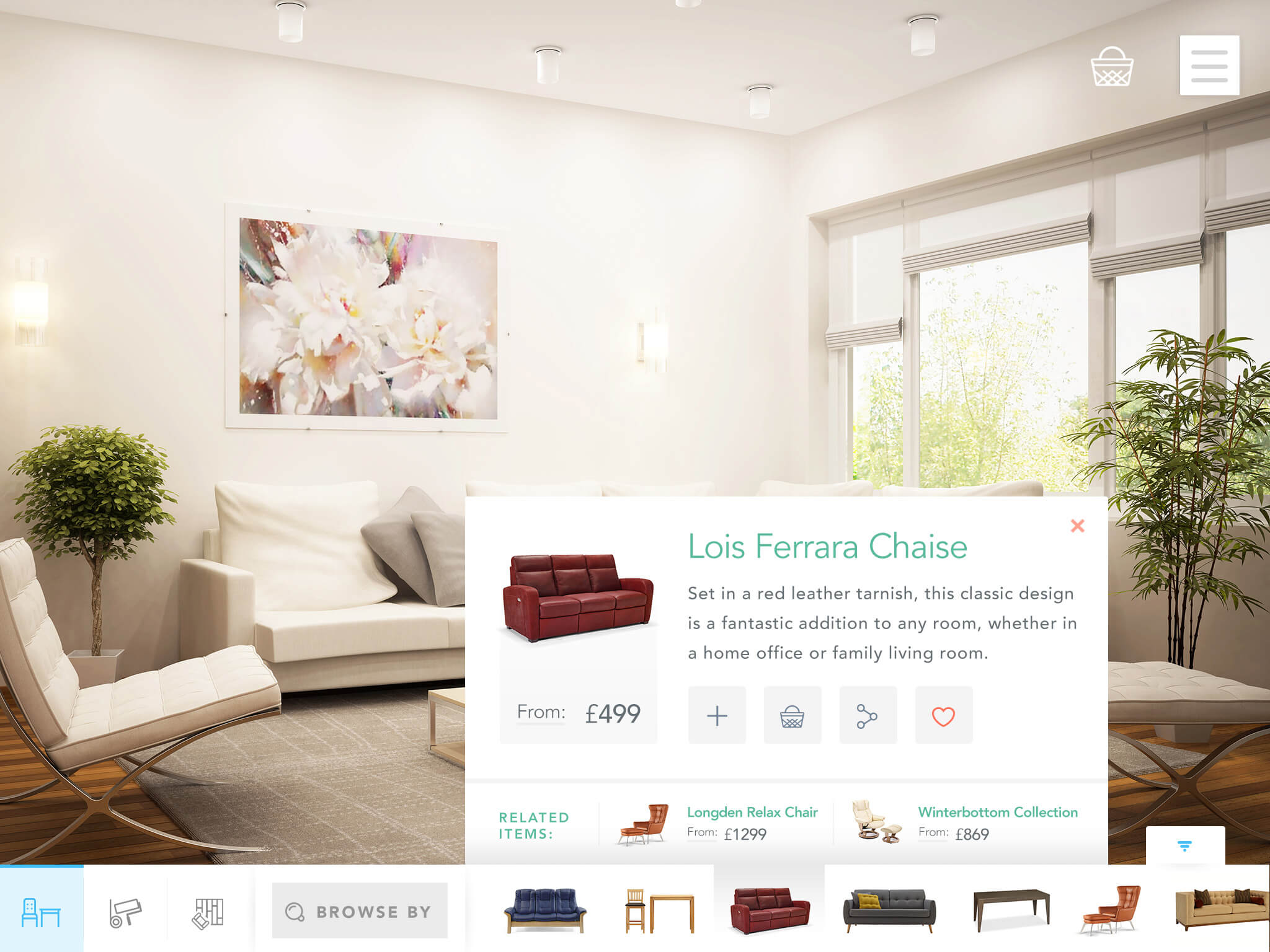
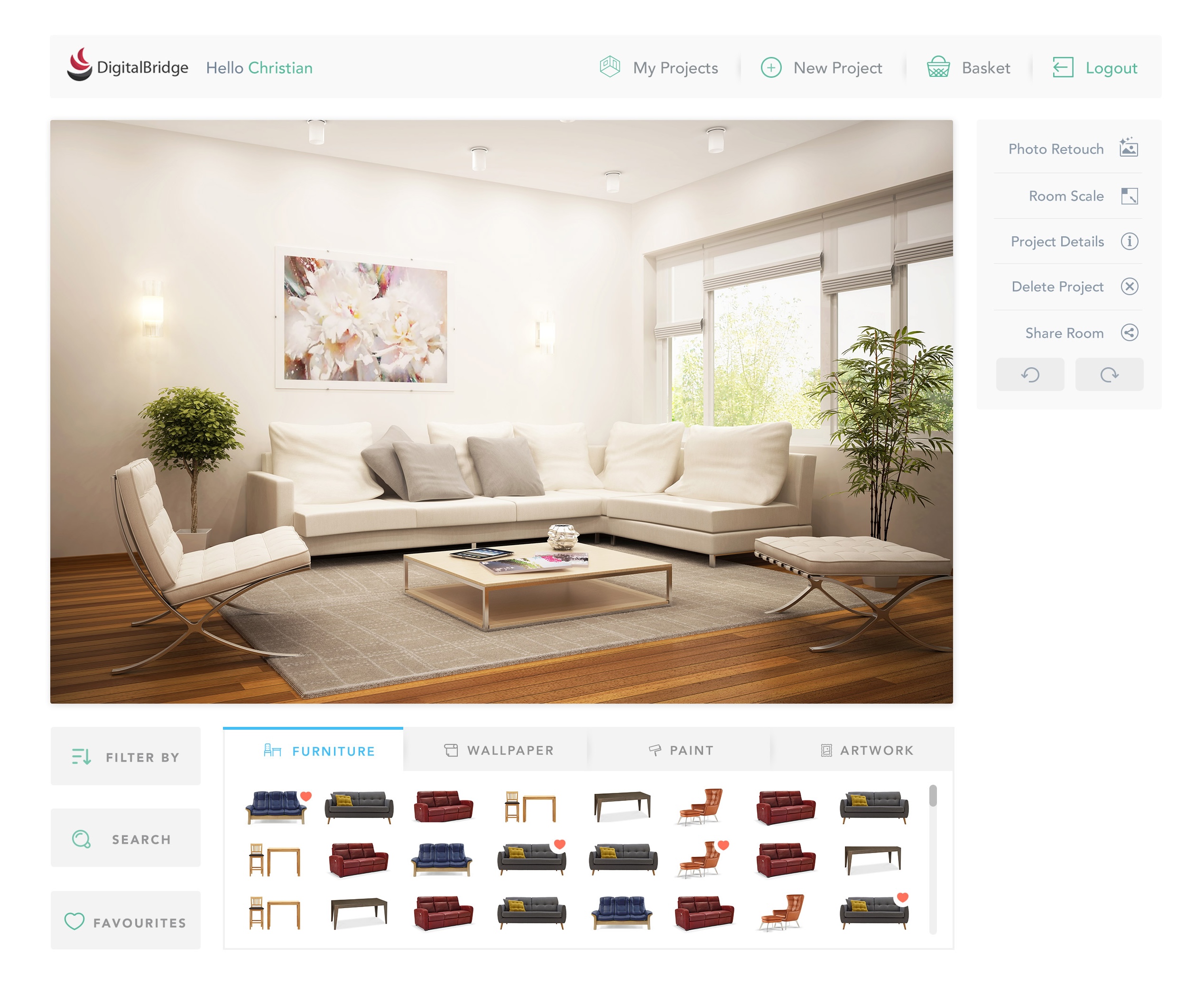
An early version of our web-based room visualiser being trialled on John Lewis' website.
Overview
DigitalBridge began as a computer-vision startup tackling a simple question: "Why can't I see how new décor will look in my room?"
The first product used AI to interpret a photo of a customer's room and let them apply wallpaper, paint, or furniture virtually, years before "AR try-on" was mainstream. It combined deep research in geometry detection, image segmentation, and photorealistic rendering with the ambition of bringing interior design into the browser.
The project was featured by NVIDIA ↗ and Techcrunch ↗ as an early example of applied AI in retail.
Joining DigitalBridge
In 2016 I joined as Head of Product, effectively the company's first product manager. At the time, the team consisted of around 12 engineers and a CEO, with no designers or other product roles. The culture was very technical, and part of my role was to bring design thinking and user empathy into the process.
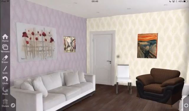
At this point, the product was an iOS app prototype that let users photograph their room and visualise home décor changes using AI-based image analysis. Photos were sent to AWS for processing, where the system detected vanishing lines and segmented the image into walls, floors, ceilings, and objects.

Impressive technology, ugly interface, terrible interior taste!
The challenge: Because the AI couldn't perfectly detect room geometry, we designed a UI that allowed users to drag and fit a virtual cube overlay to match the shape of their room. This provided spatial understanding, letting users overlay paint, wallpaper, flooring, and 3D furniture in realistic lighting conditions.
Target customers were home improvement retailers, but early sales calls made it clear that retailers did not believe shoppers were likely to install an app just to visualise their room. We made the difficult but correct decision to rewrite the product for web, using early compile-to-JavaScript technologies to bring the 3D experience directly into the browser.
Understanding the customer problem
Before diving into building the web version, I wanted to understand the actual jobs customers were hiring this tool to do.
I hired a freelance researcher and we ran Jobs To Be Done interviews with people who'd recently completed home renovations. We posted in r/manchester asking people to come in and tell us about their experience for an Amazon voucher. We did about 6 interviews.
What we learned:
The research was fascinating. We heard about:
- Triggers that finally made people take action and instigate a renovation (a leaky radiator ruining the carpet, a snarky comment from a parent-in-law)
- Forces acting on them: anxiety about getting it wrong, shame when people came round and used the tired bathroom, feeling inspired after staying in a nice hotel
- How they collected and shared ideas: mostly Pinterest, sharing boards with partners
- The decision-making dynamic: needing partner buy-in, struggling to communicate vision
Three core jobs emerged:
- Confidence – "Will this paint colour actually look good in my room with my existing furnishings?"
- Experimentation – "I want to try different options without commitment"
- Partner buy-in – "I need to show my partner what it'll look like"
These insights directly shaped the product direction.
My hands-on work
As the only person focused on product and design at this stage, I was deeply hands-on:
UI design:
- Created wireframes and final UI designs in Sketch (my go-to tool at the time)
- Handed designs to the development team for implementation
- Iterated based on technical constraints and user feedback
Improving the geometry adjustment flow:
- The AI could detect walls but often got complex rooms wrong
- Users could adjust wall positions before I joined, but the UI was confusing
- I redesigned the interaction to make it much clearer: added hover states to show interactivity, replaced the garish green wall indicators with a more pleasant design, added an instructional video to guide users through the process
- This significantly improved completion rates
Usability testing and iteration:
- Ran usability tests on the web version of the photo app
- Identified where users were dropping off and why
- Led UI improvements based on findings: clearer guidance through the 3D geometry annotation, better visual hierarchy, more obvious calls to action
- Added new features based on research insights: ability to easily compare different products in the same photo, ability to invite a partner to the project (addressing the "partner buy-in" job)
Consumer messaging:
- Built and launched small campaign landing pages to test different value propositions and messaging with consumers
- Iterated on how we talked about the product based on what resonated
From AI research to commercial product
My focus was on bridging research and product:
-
Translating AI outputs into intuitive interfaces – The AI could detect walls and floors, but users needed to understand what it had detected and how to fix it when it got things wrong. I designed UI that made the AI's work visible and correctable.
-
Working closely with the Head of AI and engineering teams – Turning early research into features that could run in production meant understanding technical constraints. I'd push for better user experiences, they'd push back on performance costs. We'd find pragmatic middle ground.
-
Leading conversations with retailers – Validating use cases and integration approaches. What would actually make retailers adopt this? How would it fit into their existing ecommerce sites?
-
Shaping the core user flow – Photo upload → geometry adjustment → virtual product overlay. Every step needed to feel obvious, even though the underlying tech was complex.
-
User research to define home décor jobs-to-be-done – Understanding the emotional forces at play (confidence, experimentation, partner buy-in) and designing features that addressed them.

The result was one of the first browser-based virtual try-on tools for home décor, enabling users to upload a photo and see real products from partner retailers in their own rooms.
As The Next Web put it at the time, the experience was "impressively accurate and fast for what it does", highlighting how far ahead of its time the product was.
Strategically, the move from iOS to web was pivotal. It didn't just improve usability, it unlocked retailer adoption, allowing integration into e-commerce websites without requiring shoppers to install an app.

The product launched with B&Q on their website. It proved that real-time visualisation could meaningfully increase buyer confidence for home décor purchases like paint and wallpaper.
From photo app to 3D bathroom planner
Through close collaboration with Kingfisher, B&Q's parent, we discovered a bigger commercial opportunity: bathroom renovation. While décor items like paint or wallpaper had modest order values, complete bathroom projects were significantly higher.
When renovating a bathroom, users would typically start from scratch rather than modify an existing room, meaning the current photo app was not suitable.
This led to us designing and building a 3D bathroom planner that allowed online shoppers to:
- Draw their own floorplan and add existing doors and windows to create a new 3D space
- Browse and filter the retailer's catalogue, searching for products such as showers, baths, and tiles
- Add products into the 3D space and move them into the optimal place
- Configure products with options like tap placement, size, and colour, and preview changes in real-time
- Generate a 360° high-quality render for a realistic view of the finished bathroom
- Add all the products in a scene directly to their online basket for purchase

My role at this point shifted from hands-on product work to more leadership and management. We added more engineers, a designer, and a couple of PMs, and I spent a lot of time in London working with Kingfisher, our design partner.
My focus was keeping everything moving: staying close to our teams, keeping the client informed, and making sure what we were building would really work for shoppers.
The bathroom design tool was deployed across multiple major retailers including B&Q, Castorama, Victorian Plumbing, and Victoria Plum (who were arch-rivals at the time).
Retailers saw longer engagement times, higher average order values, and improved positive TrustPilot feedback from users who used the planner.
This success led to DigitalBridge raising a £3m round ↗.
What I learned
Building enough technical understanding to make good product decisions:
I'm not an AI engineer or a 3D graphics expert, but I learned enough about geometry detection, image segmentation, and rendering to understand trade-offs and make informed product decisions. This taught me that PMs don't need to be experts in the underlying tech – they need to understand it well enough to bridge the gap between what's technically possible and what's useful for users.
Translating cutting-edge research into usable products is hard:
The AI could do impressive things, but impressive ≠ useful. My job was to take outputs that were 85% accurate and design experiences that made the remaining 15% feel like a feature, not a bug. The geometry adjustment UI is a good example: we couldn't make the AI perfect, so we made manual correction feel empowering rather than frustrating.
User research changes everything:
Before the JTBD interviews, we were focused on features (3D rendering! Product catalogues! AR!). After the interviews, we understood the emotional jobs: reducing anxiety, enabling experimentation, facilitating partner conversations. That shift changed what we prioritised.
Strategic pivots require conviction:
The iOS → web decision was difficult. We had to rewrite the product from scratch. But the customer insight (retailers won't adopt an app-based solution) was undeniable. Sometimes the right move is expensive and painful.
Scaling away from hands-on work has trade-offs:
As the team grew and I moved into more leadership and client-facing work, I missed being close to the product and users. I learned that I thrive when I'm closer to the work itself, something that influenced my decision to go back to hands-on building at Lemon.